Daniella messaged me in a panic: she had a few last-minute invitations to mail out and was I able to address them for her?
She was a local bride, so I told her I would definitely be able to help her out — and immediately broke out in a cold sweat. I hoped that I wouldn’t regret breaking my minimum order rule…but I ended up being so grateful that I did!
After two sets of envelopes to address, Daniella came back and asked me to create some pieces for her wedding day. This time, I was able to spend time with her and her then-fiancé Norm. We talked about lots of options for their December wedding, what they liked and didn’t like, and the overall feel they were going for.
 verola studios
Signage
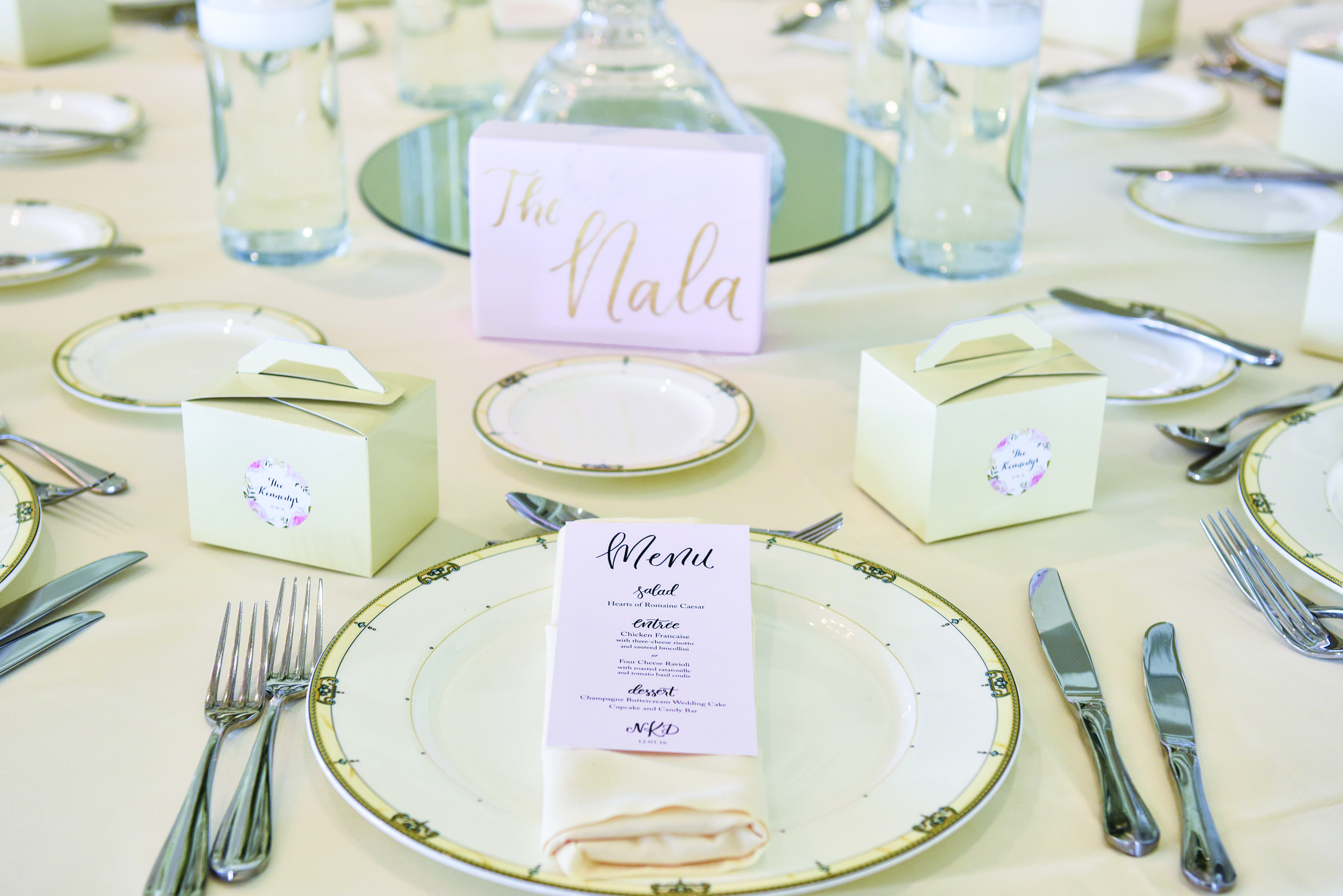
Instead of the usual light brown stain I use on my signs, we decided on light pink painted wood with shiny gold lentering in modern calligraphy. That same pink was carried throughout the paper goods (menus, ceremony programs and seating chart) as well as all of the signage I created.
On my workbench, everything looked like a lot of pink — my husband said so when he came to visit while I was working on the pieces — but I knew that with the rest of their neutral decor, those pieces would pop.
But it was the two special pieces Daniella and Norm requested that became some of my favorite pieces I’ve ever done: their Christmas ornament wedding favors and their “guestbook postcards”.
Wedding Favors
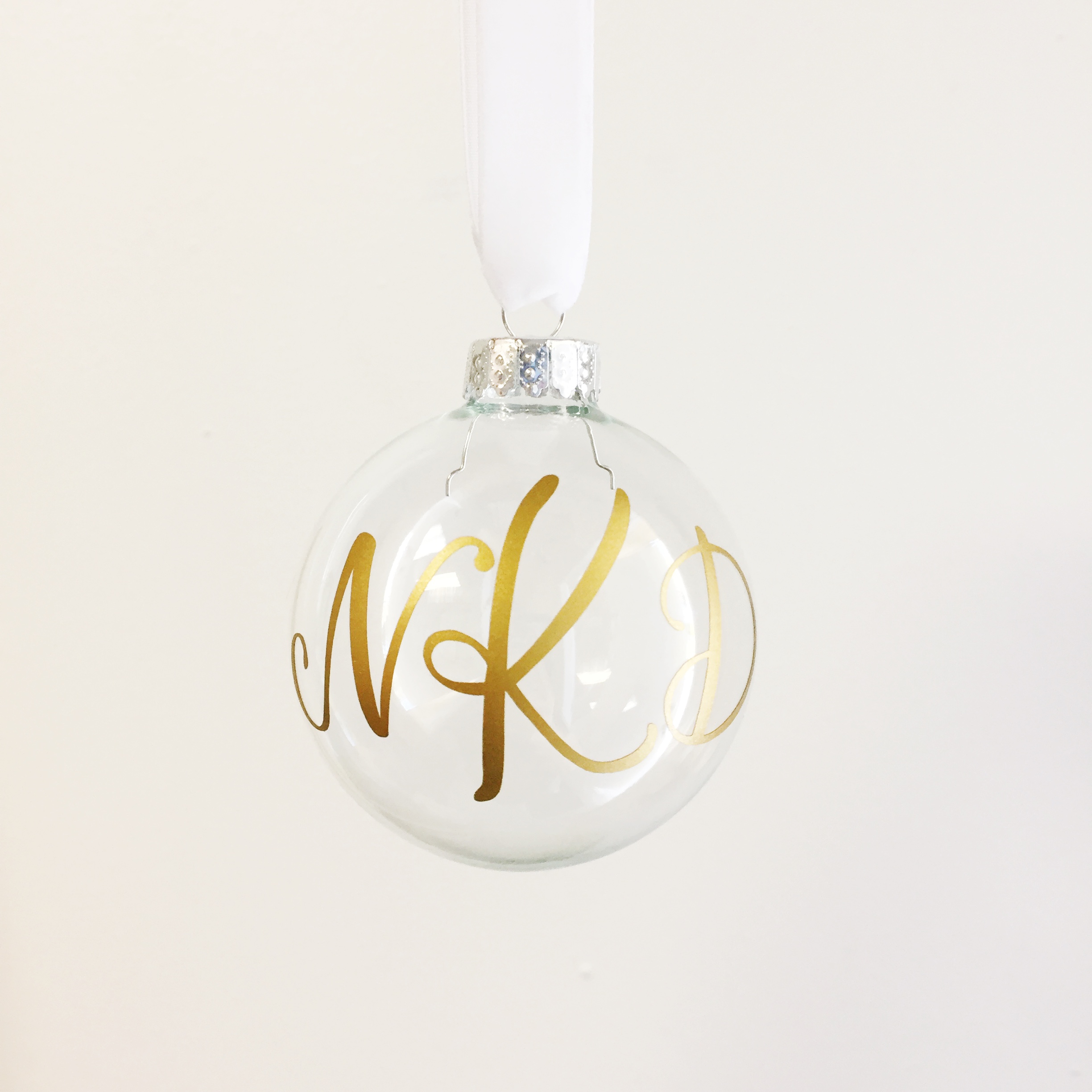
These were a bit of a challenge, as Daniella and Norm had their hearts set on gold lettering. They also requested their monogram in my modern calligraphy style, so after some testing and re-testing, we landed on vinyl for the lettering to ensure a long life.
Insider tip: gold ink, markers, paint, and any other liquid don’t really like glass. Gold is usually very sheer because most people are concerned with the level of shine/sparkle, and its typically applied over a solid color…not translucent glass.
From there, I tied white velvet ribbon to each ornament and voilá! Before I knew it, I had 120 gorgeous ornament favors ready to drop off to the happy couple.
Guestbook Postcards
I was looking forward to these from the minute Daniella and Norm mentioned them to me (real talk: there was definitely some very loud internal screaming happening) and I was so eager to start working on them that I went home and sketched out the first drafts of each of their postcards that night.
So yeah, I wasn’t excited about them at all. Not a bit.
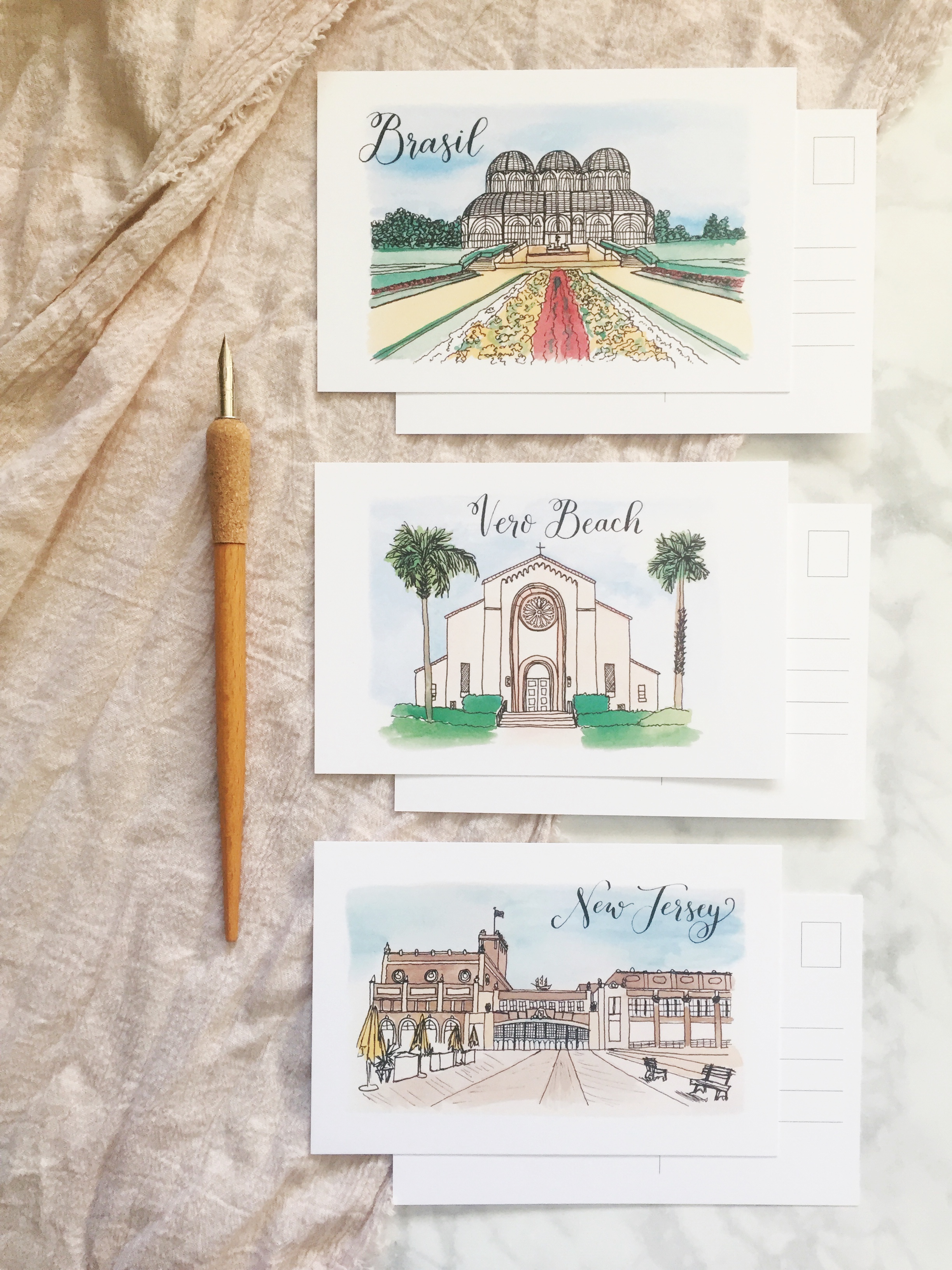
The future Mr. & Mrs. picked out three locations for me to sketch, all of which meant something to them: St. Helen’s Church (where they would be married), the famous Asbury Park boardwalk of New Jersey, and the Botanical Gardens of Curitibia, Brazil.
For these, I decided on a very loose sketch for the buildings and landscaping. The imprecise watercoloring added an interesting look as well; this wasn’t my intention until I was adding watercolor to the Botanical Gardens drawing. I was struggling not to make the flower coloring more realistic than the line drawing suggested and landed on the idea to utilize loose strokes that didn’t worry too much about staying in the lines.
The final postcards were laid out for guests to sign and drop into a birdcage for the couple to read later, which made for one of the most unique versions of a guestbook I’ve seen in a long time.
After the Wedding
About a month ago, Daniella and Norm sent me one of the most thoughtful, sweet thank you notes I’ve ever received, which further solidified in my mind that they were the one of the kindest couples I’ve met. In it, Daniella invited me to coffee — I accepted right away and we had so much fun getting to know one another without any wedding pressure.
Moral of the story? You never know when a small envelope addressing order might lead to making a friend.
xo
Holly

